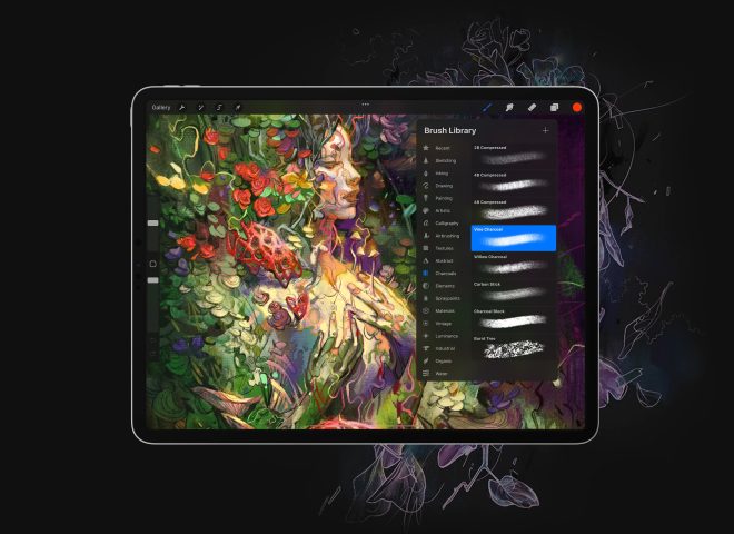
Hey there! I’m Kayla Ann. I’m an artist and illustrator who uses Astropad Studio to create my vintage-inspired digital art.
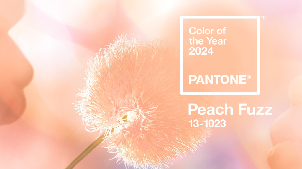
Right before the new year, Pantone released their 2024 color of the year—Peach Fuzz (13-1023)!
Integrating the color of the year into your digital art not only attracts more attention to your work, but also aligns your portfolio with current trends.
Today, I’ll share some ideas on how to seamlessly incorporate Pantone’s 2024 color of the year into your digital art. Let’s dig in!
1. Create a color palette that compliments Peach Fuzz
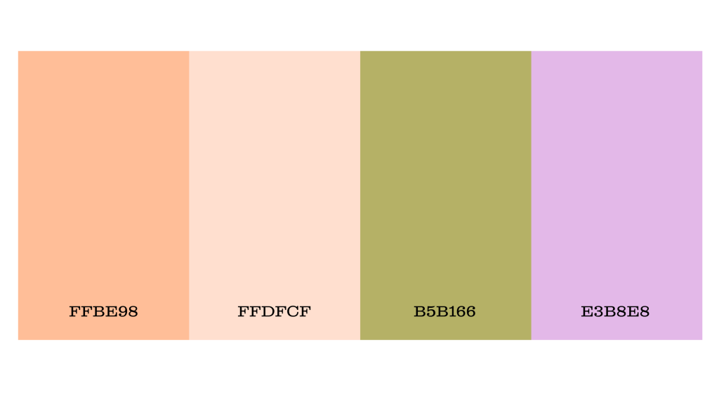
Incorporating Peach Fuzz into your palettes requires a tasteful blend with existing hues that complement the color. Harmonious blue shades, positioned opposite Peach Fuzz on the color wheel, create a balanced combination.
Furthermore, warm tones like pinks, oranges, and greens can boost the vibrancy of Peach Fuzz. To assist your creativity, I’ve designed a simple color palette for reference while you work with Peach Fuzz.
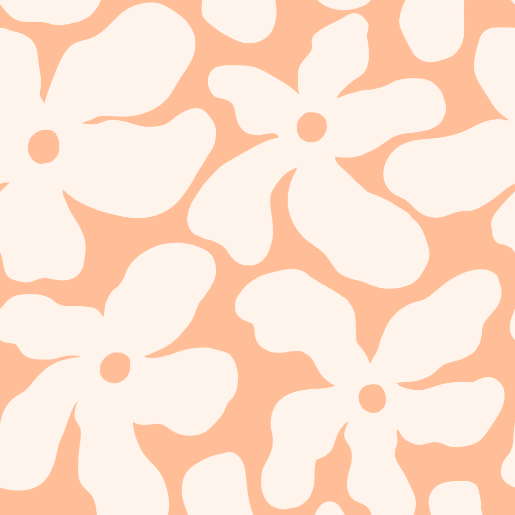
2. Develop a Peach Fuzz collection of illustrations, patterns, and digital art
When exploring new themes or color schemes, I focus on creating a series of cohesive illustrations and patterns that blend seamlessly. This approach not only enhances my personal brand but also ensures visual harmony in my portfolio.
Using Pantone’s color of the year as inspiration for a collection is a great way to add artwork to your portfolio that catches the eye of art directors and clients. Consider your go-to motifs or themes and find creative ways to incorporate the soft, dreamy tones of Peach Fuzz.
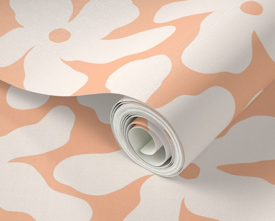
3. Incorporate Peach Fuzz into your product offerings
If you’re in the business of turning your art into products for local markets or your online platform, consider adding options that incorporate Pantone’s color of the year.
This simple strategy can boost traffic to your marketplace, drawing more attention to your work. Enhance your product descriptions by incorporating keywords related to Pantone Peach Fuzz to help increase discoverability.
Fortunately, Peach Fuzz aligns seamlessly with my existing brand colors and color palette. This simplifies the process of integrating the color of the year into my work, although I consistently develop and recolor collections to incorporate the latest trends.
How about you? How have you been infusing Peach Fuzz into your art?