“Design does not make a product more innovative, powerful or valuable than it really is. It does not attempt to manipulate the consumer with promises that cannot be kept.”
— Dieter Rams, Principles for good design
I grew up near the city of Modena, Italy — a place famous for its fast cars. In those days, you would see quite a number of them on the town streets. Sexy Ferraris and Lamborghinis were regularly taken out for a spin just outside of their respective automobile factories.
When I was a child, I didn’t really understand what made a Ferrari so special. I thought the magic was all in its appearance. I remember asking my dad, why can’t Ford make a car that looks as sexy as a Ferrari? Imagine, a super sexy Ferrari chassis and a Ford engine… Maybe my family could finally own an affordable AND good-looking car like those!
As a designer today, I understand that that is a terrible idea. Whenever there is a disconnect in the design of a product, we feel scammed. The design feels deceiving, dishonest.
This might seem obvious. But is honesty in design really obvious these days? I am going to give 2 examples to show that even major design companies still struggle with honesty.
The Ferrari example above should clarify that honest design is not only about the facade of a product but also the intrinsic message associated with it. Some people call this marketing…
Marketing Case Study: Apple’s ResearchKit & Apple Watch
The principle of honest design is equally important in marketing. In the latest Apple keynote, “Spring Forward”, we find examples of both honest and dishonest design.
Apple introduced ResearchKit, a new set of tools to help universities enroll iPhone users in medical research projects. This enables research centers an unprecedented level of access to a large set of the population for the purpose of medical research. The marketing message and the product are aligned. The design is honest. ResearchKit has the potential of improving our lives. On stage during the keynote, Jeff Williams, appears convincing (16-minute mark in the keynote).
Also in the latest keynote, Apple re-introduced the Apple Watch. To talk about it, they decided to use a testimonial by Christy Turlington Burns. She is an ex-supermodel, mother, and founder of Every Mother Counts — a non-profit organization dedicated to making pregnancy and childbirth safe for every mother. in the keynote, we find her in Africa running a marathon… But what does that have to do with Apple Watch or her mission?
There is a profound disconnect between the Apple Watch and Christy’s mission. The Apple Watch is a tech gadget with a potential price point of over $10,000. It has nothing to do with helping charity. It feels like Apple is trying to hide something by associating themselves with Christy. The iPhone didn’t need a celebrity testimonial to convince us that it was awesome. Not even Tim Cook or Christy Turlington Burns appears convincing on stage. Their conversation feels awkward and unnatural. It happens at the 64-minute mark in the keynote; judge for yourself.
Product Case Study: Adobe Ink & Pencil by FiftyThree
Many companies have designed styluses for the iPad. While building Astropad, we reviewed the entire market. Two companies in particular took very different approaches.
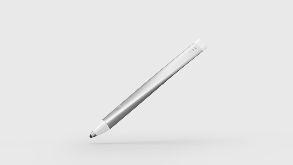
Adobe created Ink, a beautiful piece of curved aluminum with a very slick, white enclosure. It even has multi-colored LEDs in the back of the pen that create a cool rainbow effect when it is recharging. The external design is fantastic; it feels like a futuristic stylus from outer space.
Unfortunately, when you actually use it, you quickly realize the stylus lacks precision. When you touch the stylus to the screen, about 90% of the time, the stylus doesn’t leave the mark where you expect. The stylus has an amazing chassis with a poor engine. User reviews show complete disappointment with the dishonest design.
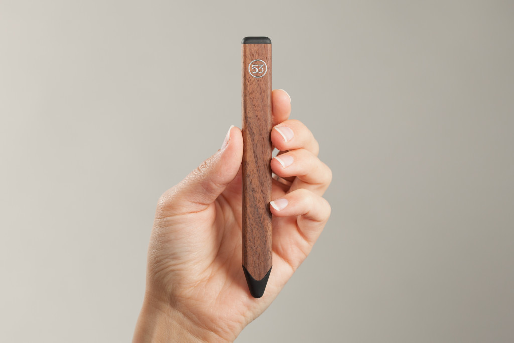
FiftyThree instead, took a radically different approach when designing Pencil. The design is down to earth — literally, the stylus is made of natural wood. The stylus is pleasant to the eye and looks like a friendly, large crayon. It is not claiming to be more than a regular “pencil”. Given the fat crayon tip you don’t have expectations of incredible precision, but in use, it is quite nice. The design is honest and people resonate with it.
Conclusion
Honest design is difficult. It must take into account the experience of a product as a whole. It is a cross-functional effort that involves multiple teams, sometimes entire departments.
A product perceived as honest will show respect for its buyer. It will create a sense of trust, which is one of the most valuable intangibles one can find in a product.
When designing Astropad, honesty was one of our key objectives, but this will be the subject of another blog post…
