
We’re currently on the hunt for our first full-time designer at Astro HQ. After combing through hundreds of applicants, I’ve noticed a few mistakes that designers make over and over again when they submit their work. Leaving a solid first impression is everything when it comes to making it to the interview round. Here are a few tips to polish your portfolio and stand out as a designer:
1. Make sure your portfolio is easy to access
It’s surprising how many portfolio links I’ve clicked that have lead me to a “host not found” error. Double check that your site is up and it isn’t password protected. And if I have to contact you first to get a portfolio link, chances are you’ll get skipped over instead. It might sound like a minor inconvenience, but when you’re one of 500 applications, I don’t have time to hunt down your portfolio.
2. Break up your work by category
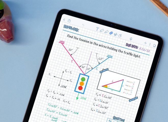
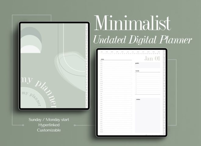
I love it when a candidate’s work is broken up into categories, such as — mobile, web, illustrations, branding, etc. It makes it much easier for me to hone in on the skills I’m looking for. For example, at Astro HQ we care a lot about mobile UI/UX design, but branding skills aren’t as high of a priority. So it’s great if I don’t have to wade through dozens of branding pieces to find the mobile UI/UX work you’ve done.
3. Highlight what you’re most proud of
Many portfolios I check out are HUGE, and it can be overwhelming. Instead, choose some of your favorites in each category and make those the first pieces of work I see. That puts your best foot forward and doesn’t require me to find the gems among dozens or even hundreds of portfolio pieces.
4. Show less process, more design
Many portfolios bury the final design under pages of research, user interviews, and wireframes. While it’s nice to see some of the design processes, let’s be honest — I’m mostly interested in the final result. When working with a visual designer, what counts is the effectiveness and appearance of the final design. Understanding your process is something that I’d rather learn more about during an interview with you. At a minimum, put your final design at the beginning so I can choose whether or not I want to delve into your process.
5. Use high-quality assets
It’s tough to judge a portfolio piece when it’s highly compressed and pixelated. It also doesn’t reflect well on a designer’s attention to detail. It’s hard to tell — is that part of the design or is it a JPEG artifact? Please save your image assets as high-quality JPEGs or PNGs. Better yet, make it so that I can click on it to get a super high-resolution copy for when I want to inspect a pixel-perfect mockup.
6. Get rid of the dated stuff
Your portfolio doesn’t have to contain everything you’ve ever worked on. It’s best if it’s a highly curated selection of your favorite and recent work. Some portfolios I’ve encountered have work dating back to the early 2000s with heavy shadows, gradients and skeuomorphic elements that look really dated today. It leaves the impression that you haven’t done much recent work and I’ll wonder if you’re keeping up with design trends. Don’t get me wrong, the best designers know when to break from the trend — but that also requires working within what’s current.
7. Include a stretch piece
The problem with design trends is after looking at hundreds of portfolios, they all start to look the same. I see the same bright colors, with the same translucency and gradients over and over again. That shows me you can produce (or copy) designs that look modern and trendy, but it doesn’t show me your range. I want to see your creativity come through. After all, designers are called creative professionals for a reason! Show me something wild and crazy, and that you’re capable of innovative design that could be the next trend.
—
If you enjoyed this, follow Matt on Twitter at @mronge for future updates.