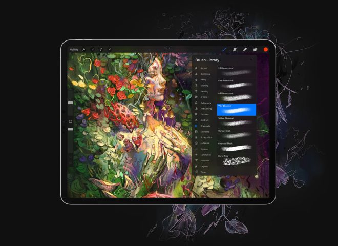
I used to be intimidated by figuring out what colors I wanted to use in my work. But I’ve found over time that using limited color palettes tends to produce better results for my illustrations.
Thankfully, Procreate offers some helpful tools for building cohesive color palettes. Let’s get started!
First, use color psychology to set the mood
Color is a powerful communication tool. Before you get started with your piece, think about what kind of atmosphere you want to project.
I often draw lots of cozy environments in my art, so I tend to use colors that portray friendliness and warmth. Warmer color palettes with reds, oranges, and yellows convey a warm and inviting environment.
👉 Need some inspiration? I like the palette generator website Coolors — it’s helpful to see colors next to each other to make sure your palette conveys the right vibe.
Pull colors from reference images in Procreate
Procreate has a great feature where you can upload an image to generate a palette.
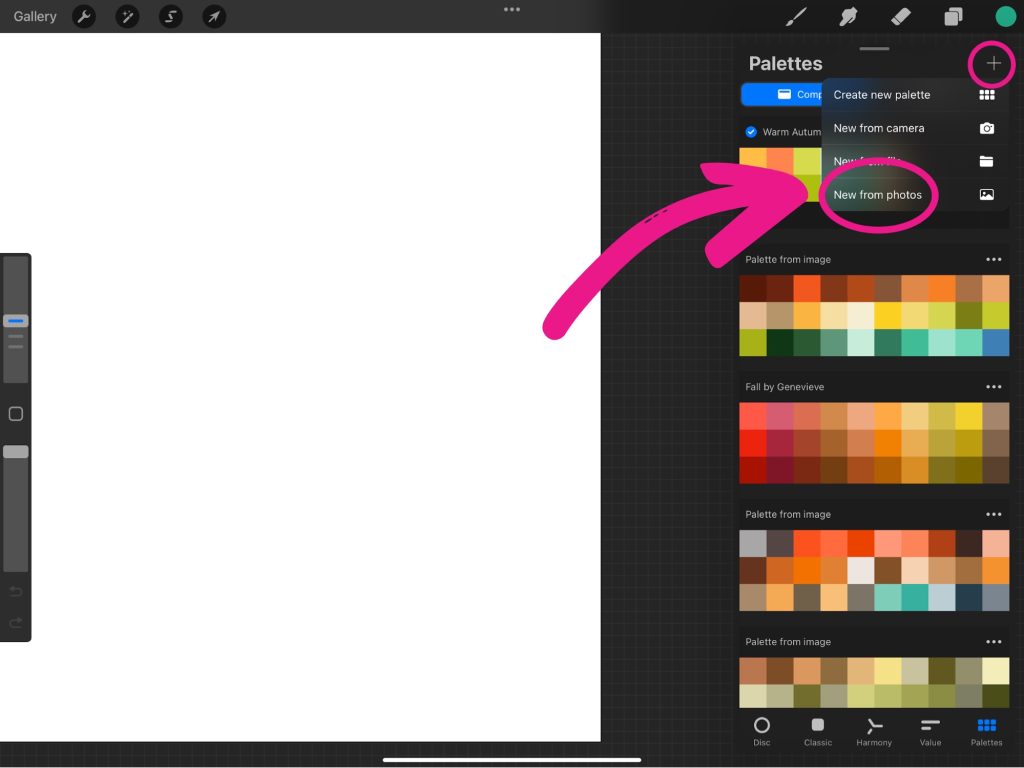
To access this feature, head to Colors > Palettes then click the “+” icon at the top right of the menu.
Then select New From Photos. This will give you the option to choose a photo you have previously saved. It will then be turned into a color palette for you to use.
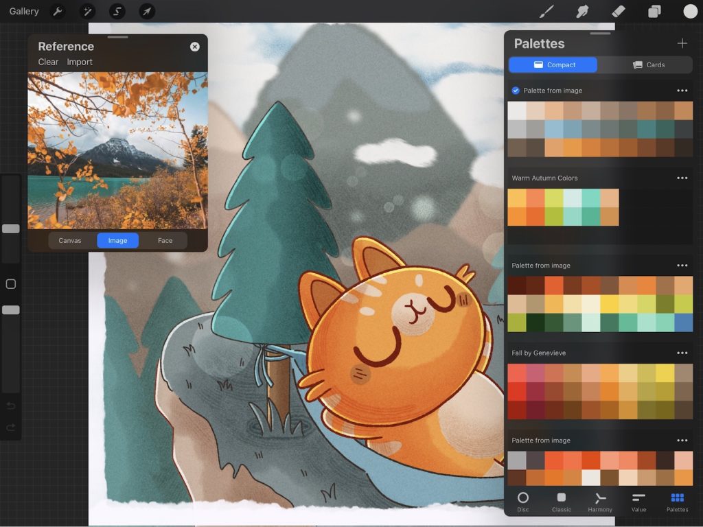
I recently visited the mountains, so I wanted this drawing to be inspired by the colors and emotions I felt while being out in the fresh mountain air.
Here’s the photo I uploaded to Procreate’s Palette Generator:
The top palette is the one that Procreate generated from the Reference image I uploaded. To make the cat pop against the mountain background, I chose the orange color from the leaves in the reference image.
Find complementary colors with ‘Color Harmony‘ in Procreate
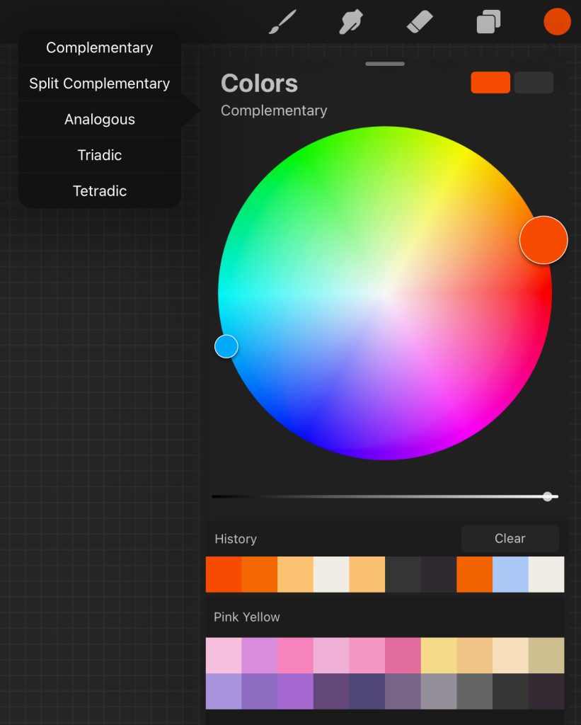
Don’t feel locked into your palette. Sometimes it can work in your favor to add colors of the opposite spectrum in your piece as well. For example, on the complementary color wheel, red’s complementary color is blue.
Procreate makes it easy to find complementary colors for your work! Open up the color menu, and tap Harmony > Complementary at the top left corner. This tool displays a color wheel with your selected color and the direct opposite color. You can adjust the hue, saturation, and tonal value for your selected color.
Tap on Complementary at the top of the wheel to view other color harmonies, such as Split Complementary, Analogous, Triadic, and Tetradic.
Tap each color on the color wheel to add it into your custom palette.
Add tints and shades to your palette
If you stick with a limited palette of 4 colors, that doesn’t mean you can’t alter the tint or shade of those colors. It’s often vital to adjust some of the colors for shading or adding highlights to your illustration.
Procreate makes adjusting the colors very easy:
- Add white to produce a tint: Drag the color slider to the right
- Add black to create a shade: Drag the color slider to the left
👉 Pro Tip: Use ‘Multiply Blend Mode‘ in Procreate to add ambient light to your illustration. → View tutorial
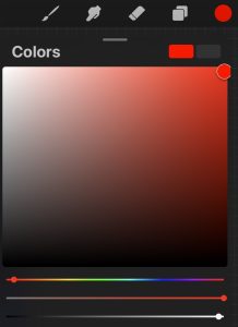
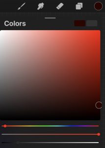
Use Procreate’s ‘Recolor‘ tool to quickly change colors
If you want to change up the colors in your piece, the ‘Recolor’ tool in Procreate is an efficient way to do that.
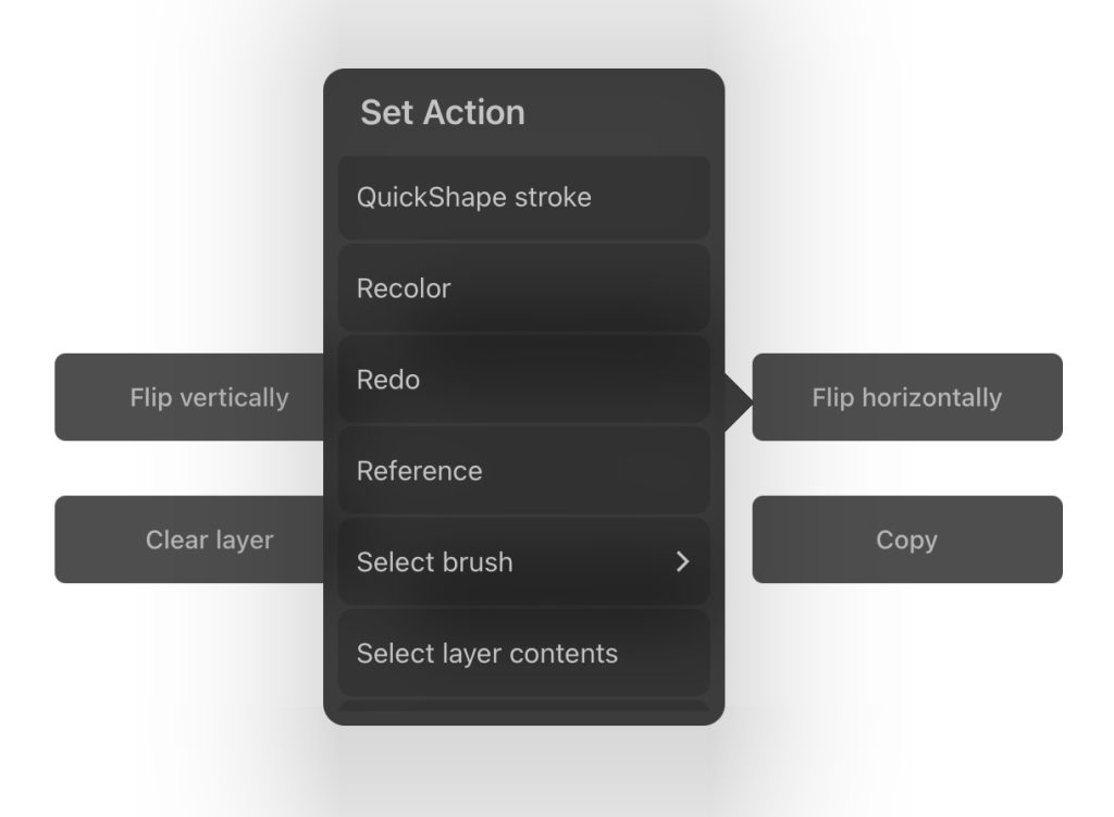
Open up your Settings > Preferences > Gesture Controls > Quick Menu. Under Quick Menu, choose which option you prefer for accessing the Quick Menu.
Then, exit out of all the menus and go back to your drawing and use whichever gesture you used for accessing the Quick Menu. Tap and hold on of the options you’d like to change, and find Recolor in the list.
Once you have it set, you can go to the color picker to choose a new color, and then use the Recolor option. Drag the crosshair over the area in your illustration that you want to change.
You can even adjust the Flood which acts as a threshold of color around your selected area.
I hope these techniques will help you choose colors that pop in your next illustration project. Happy drawing!


