My art journey so far
Throughout my entire art career, I’ve always been really invested in drawing and painting human subjects. Even in preschool, I remember once getting in trouble for drawing a nude figure. In high school, I was fascinated with capturing facial expressions in charcoal. In college and recent years, I relished the challenge of transcribing the delicate and emotional range of the human body onto blank canvases.
But the more I practiced painting people, the more I realized how much my skills were lagging when it came to painting any other subject matter; and the more daunting the idea of trying something outside of my comfort zone became! Yet, these limitations started to gnaw at me, growing more obvious and continually stifling my artwork so that I could no longer ignore the gaping holes in my skill set.
Challenging my limits
So lately, I’ve tried to take some concrete steps towards that discomfort. Arming myself with YouTube tutorials and art classes galore, I’ve been tackling more landscapes and architecture — things that, up until a few years ago, I’d have thought myself incapable of rendering and too nervous to go near.
It’s been such an exciting journey so far. Though landscapes and human subjects initially appeared immeasurably disparate from one another, I’ve learned that there actually can be quite a lot of overlap in the painting process, the light and shadow concepts, and the ways in which you can distill complex ideas into more manageable pieces.
Today, we’re painting this waterfall in Vietnam. When I first picked out this landscape, I wasn’t confident about what I’d just signed myself up for. Considering my last video, where I painted a little Mediterranean doorstep, it felt like quite an enormous leap in such a short span of time: going from one tree in front of a mostly blank wall, to an entire forest set among multiple interwoven cascades of water. But determination won over uncertainty, and here we are! So, let me walk you through how I made it to the finish line 🙂
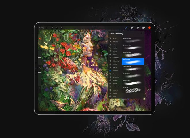
My digital art tool setup
- Astropad Studio app to use touch gesture Photoshop shortcuts on my iPad
- Luna Display dongle to extend Mac desktop onto iPad
- Adobe Photoshop app on macOS
- Procreate app
- Apple Pencil 2
- 12.9″ iPad Pro, 3rd gen (2018)
- 15″ MacBook Pro (2018)
- 5K LG monitor
12 Digital Art Drawing Exercises for Your iPad
Step 1: Give yourself a blueprint
I always start out with a loose sketch to map out landmarks and proportions. I’ve noticed that if I dive headfirst into a painting without a general blueprint, my proportions can get a little funky. And once those inaccurate dimensions start to set, it’s hard to make larger adjustments without causing a lot of headache and repainting.
Plus, the sketch keeps my perspective from getting too skewed as I’m constantly shifting attention between the reference photo on my desktop monitor, and my iPad screen sitting on my desk.
Having some guidelines that I can fall back on is the first important step in metastasizing a complicated piece and making sure I don’t get overwhelmed by it!
Having some guidelines to fall back on helps prevent getting overwhelmed early on.
Step 2: Finding a starting point
After the sketching part, it can feel like there’s still a very long road ahead, especially with a waterfall scene like this — tons of textures and things going on — how am I ever to find a starting point?
Simplify your shapes
One way I learned to simplify a scene was to squint at the photo. With eyes nearly shut, the texture and details start to blur together and become less distracting, allowing me to more clearly see the important masses of light and shadow.
In my art classes, we were taught that light and shadow play a huge role in photography and filmography. Light and shadow not only serve as a means to clarify a convoluted scape but also to create interest through contrast and balance. I’ve still got a lot to learn about applying light and shadow in my personal work, but in the meantime, it’s a great tool for helping me analyze these scenes.
Try finding the light and shadow shapes by squinting at the photo.
Step 3: How to add color
So we have our sketch, and we have our idea about the large shapes of shadow and light. Now how do we add color? A seemingly innocent question with quite a loaded answer. Luckily, at the beginning of a painting, it’s a bit simpler.
The first brush stroke is not the final
To me, the first colors I put down are not profoundly important.. Of course, perfecting my color choices earlier on in a painting would be an efficient and effective use of time — but this type of thinking is only helpful to an extent and can be rather ‘shameful’ or paralyzing when I’m already working outside of my comfort zone.
While my goal remains to continually improve my understanding of color, I’ve done this enough times now to realize that the colors I put down first will probably not be the exact same colors I end up with, so I’m not going to tie myself in knots trying to perfect it from the get-go. Instead, my focus is on getting something — anything — down to start having something to react to.
Start with simple concepts
I’m starting with simple concepts and allowing them to get more complex and nuanced as I go, so I don’t completely overwhelm myself from the start. I’m just letting the colors converse and influence each other, with the basic underlying concept that the sunlit side will have warmer colors, and the shadow side will have cool colors. Later on, there will be some exceptions to this concept (some warmer hues in the traditionally ‘cool’ side and vice versa) due to local colors and ambient light.
I’m starting with the basic concept of warm highlights and cool shadows, and will get more nuanced as I go.
After laying down some base colors, I started adding more values in both the sunlit and shadow side of the painting to start carving out the foliage, cliffs, and waterfalls in the landscape.
I tried to concentrate on figuring out the actual local colors of the objects before considering how other elements like mist or ambient light would affect certain areas.
Interpret and adjust
To be clear, I think of base colors a little bit differently from local colors. Local colors are the actual colors of the objects, whereas base colors, for me, are just preliminary hues — a first coat of paint for me to determine how it feels, and how to adjust to get closer to the local color. (I’m not even sure whether “base colors” is a real term or just something I made up to describe the situation! 😅)
Painting the base colors and local colors were not separate stages for me. Rather, they were happening simultaneously as I was constantly interacting with the evolving draft of the painting:
Put some colors down. React. Adjust. Repeat.
Step 4: Creating atmospheric perspective
After some time, I switched focus back to the mountains in the way back, since they were still rather flat, and I wanted to give them a little more dimension.
I considered the mountains as part of the backdrop, separate from the sunlit and shadow sides of the painting. Since they were so far away, they didn’t fall into the easy categorization of light and shadow.
As I added some texture to the mountains, I was careful to not add as much detail, contrast, or saturation as I will in the rest of the painting, and I gave the mountains a slightly cooler haze to maintain that atmospheric perspective seen in the photo, which gives the mountains that “far-away feel”.
Atmospheric perspective gives the mountains that “far-away feel”.
Step 5: Adding depth to the middle ground
Dividing the piece into levels
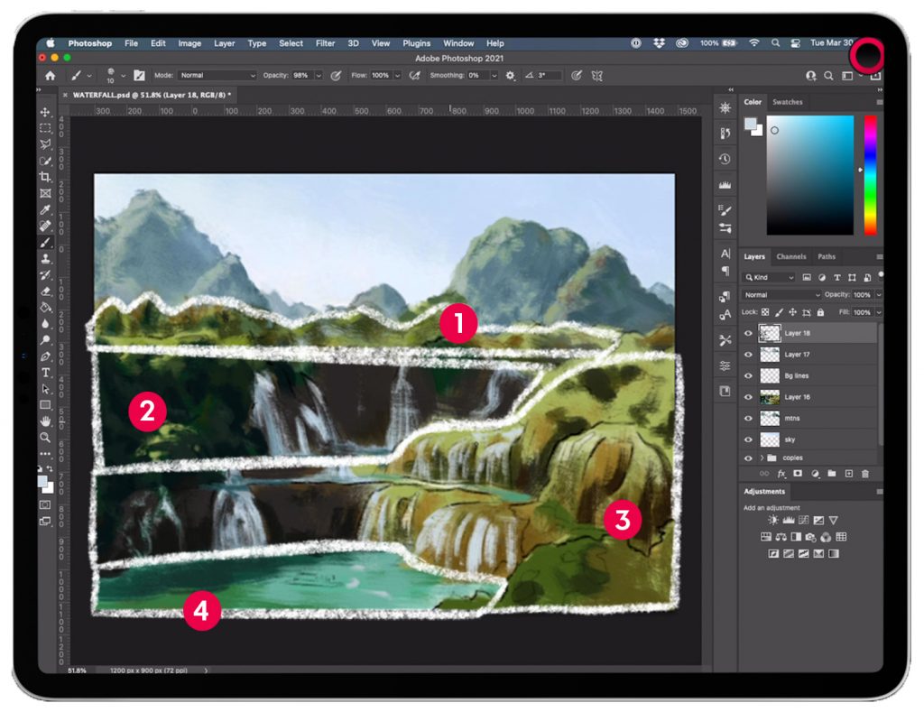
Now that I’ve warmed up a bit, got the backdrop set, and have established a general landscape, I’m ready to dig into the details and flesh out the different levels of this waterfall. The way I’ve divvied it up in my mind might not make the most sense to everyone, but this was the best way for me to think of it:
- The highest cliff
- The first layer of waterfalls
- The second layer of waterfalls
- The body of water that the waterfalls feed into
Deciding factors in creating the tiers
I tried to think not only in terms of the literal levels of the waterfall but also the depth of each level and how different pieces overlapped or were more prominent than others. Therefore, the really shallow waterfall that almost immediately bleeds into what I’ve deemed the “second layer” got grouped into the “second layer” as well (instead of becoming its own slice of the pie).
Additionally, since the large hills on the right side of the landscape jut out in front of the “first layer of waterfalls,” I pushed them into the “second layer” (rather than keeping them a part of the “first layer”). To me, this helps maintain the depth and cavernous feeling of the “first layer of waterfalls,” by acknowledging the hills as a totally separate part.
I know that the bushes in the front of the “second layer” could technically be considered foreground, however, because I could see their winding path back towards the waterfalls of the “second layer”, I decided to keep them grouped together.
What’s most manageable for your flow
I could have split this whole scene a hundred ways and into even more layers, but the point here was all about trying to find large, manageable pieces so that I didn’t have to contend with everything going on in the scene all at once.
It’s a constant process of considering how to turn the landscape into bite-size pieces.
Step 6: Understanding warm, cool, and ambient light
Warm highlights = Cool shadows (sometimes)
Continuing with the basic “warm highlights – cool shadows” concept, I’m pushing the contrast and trying to get more accurate colors by doing some color filter adjustments.
I created a new layer, and then used “Command + Option + Shift + E” to create a flattened version of all my previous layers within that new layer. This Photoshop shortcut works as a sort of snapshot of my work-in-progress that I can manipulate as one image, instead of many (many many) separate layers. From there, I used a yellow color filter to bump up the warmth and golden sunshine-y-ness (a very not-made-up-on-the-spot technical term :P) in the photo. I then erased the shadow side of this yellow-filtered layer to reveal the cooler tones from all previous layers, thus leaving the shadow side unaffected by the yellow filter.
I briefly hid the yellow-filtered layer and created a second composite (of all visible layers), to which I added a blue color filter to pull out the cool tones in the shadow side. Then – you guessed it – I erased the sunlit side of the blue-filtered layer so that the sunlit side was not affected by the blue filter. In effect, the color-filtered layers helped shift the sunlit and shadow that much warmer or cooler, respectively.
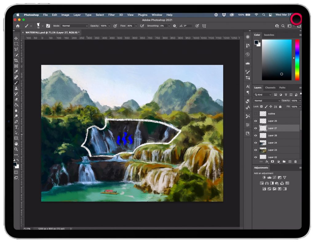
In the deep-set parts of the landscape on the shadow side, the “cool shadows” concept is mostly working without exception — especially in the concave area of the first layer of waterfalls, where some bluer mist rising from the water is dulling any ambient warmth reflecting off of the plants and shrubs on the right.
The effects of light sources on water
Water is also tricky. Because of its translucent nature, I’ve noticed the local color is super dependent on the surrounding environment. For example, the body of water that all the waterfalls are feeding into seems to have a local color of teal or emerald green mix. It probably has something to do with the ecosystem both around and beneath the surface, the lack of water foaminess from not propelling off of a cliff (like the waterfalls), and many other elements. I’ve painted it a bit more cool-toned than I’d like since it’s on the sunlit side, so I’ll probably mess with that later.
Unlike the body of water, the local color of the waterfalls is a plain white / light gray, so it’s a little more straightforward. When the water is in the sun, it takes on the color of the sun rays – a yellow or warm tinge. And when the water is on the shady side, it’s got more of a blue hue because the dominant light is now coming from the blue sky.
Because of its translucent nature, I’ve noticed the local color of water is super dependent on the surrounding environment.
Exceptions to the rule
The warm highlights continue to work when the sunlight is breaking through the trees The “warm highlights – cool shadows” concept is meant to be a basic understanding of light and shadow, but it is by no means the end-all be-all.
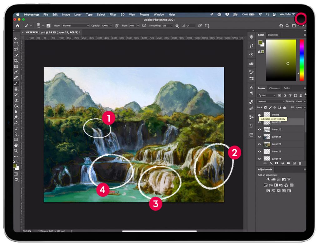
Below, we can see instances in which there are both warm and cool highlights and shadows in the shadow side of the painting; and cases where there are both warm and cool shadows in the sunlit side of the painting.
- The sunlight breaking through the trees is causing the waterfall to have a warm highlight, despite the waterfall being mostly in shadow. Where the sunlight is unable to reach the waterfall(s), the sky gives them a cool highlight.
- Here, the plane of the waterfall is turning away from the direct light of the sun, therefore, it only receives the blue ambient light from the sky. This example holds up the warm highlight – cool shadows concept.
- Contrary to #2, in instance #3, the shadows from planes of the waterfall facing slightly away from the sun are still warm. The reddish rocks at the base of the falls create a warm ambience, stronger than that of the blue sky, likely due to their closer proximity to the waterfall and the fact that the waterfall planes are still mostly facing the sun. The shadows of the waterfall here are thus tinted shades of red, warm green, and warm yellow.
- What’s even more interesting is that because these warm shadows are set next to some even hotter colors (e.g., bright warm yellows), the shadows still appear a bit cool. But it’s only in relation to the hot colors sitting nearby that these seem cooler. (See the finished painting at the bottom of this post for reference)
- Some of the rocks and foliage have naturally warmer local colors, causing them to retain warmer hues on the “cool shadows side” of the painting. I noticed this happen especially with the rock and foliage most closely located to the ‘line’ where the sunlight takes over as the main source of light.
Below, there are instances in which the color “rule” works, and instances in which it seems contradicted!
I’ve still got a great deal to learn about how local color and ambient light influence what we (think we) see, so definitely take my musings with a grain of salt! Here are some video resources that I’ve found super helpful in my work. The videos were created by a couple of fantastic professional artists who are much more informed and better at explaining the color concepts. 🙂
- The (Not) Rules of Color Temperature series by Nathan Fowkes
- Colour Harmony by Marco Bucci
- Understanding Shadow Colors by Marco Bucci
Step 7: Strategically-placed finishing touches
Seeing as color is such a convoluted topic, it should come as no surprise that I spent a ton more time doing color analysis (aka messing around 🙃) trying to get the look I was going for. Eventually, I exported the painting from Photoshop on my Mac into Procreate on my iPad to keep tightening things up.
My goals for this painting were to practice a complex landscape and to learn more about how to use color.
Keep the details concentrated around your focal point
As I started to finalize all of the pieces of the landscape, I tried to keep most of the concentration of details on the boat and the objects closest to it (as opposed to spread evenly throughout the painting).
Having a smaller, densely-packed area of details tends to stand out more when juxtaposed with the less-rendered surroundings. Our eyes are naturally drawn to complexities. And in this case, I wanted the focus to be on the boat. It’s integral to this scene for me because it gives the viewer a tangible size reference to grasp the magnitude of the falls. Without a way for us to view the falls in relation to ourselves (i.e., the boat of people), it would be harder to connect with the scene, and I think some of the grandeur would be lost.
Use natural elements to direct attention
To bring even more attention to the boat, I put more indications of water ripples near it, while deemphasizing the movement in the water further away. Beyond the proximity of the boat, I represented the water only with flat, broader blocks of color, void of the busy reflections of sunlight bouncing off all of the facets of the surface. I think the added detail could have been an asset, but I didn’t want to muddy my leading lines. Those, I created by emphasizing the wake and white foam trails that boats already naturally make in the water.
I also added a little red glaze across the entire raft because I felt like it didn’t stand out enough in the photo, and I pushed the falls back with some more atmospheric perspective.
I finished with a cold and warm wash on either side of the painting to contrast the depth a teeeeensy bit more, but honestly, I could probably noodle over this painting forever and never call it done.
My goals for this painting were just to practice tackling a complex landscape and to learn more about how to use color. I think I accomplished at least one and a half of those objectives, so let’s leave it here! 😉
Start your 14-day FREE trial when you sign up for Astropad Studio
Ready to level up your creative workflow?
Astropad Studio turns your iPad into a customizable drawing tablet. Draw directly into your favorite desktop apps like Photoshop, Illustrator, Clip Studio Paint — right on your iPad!
