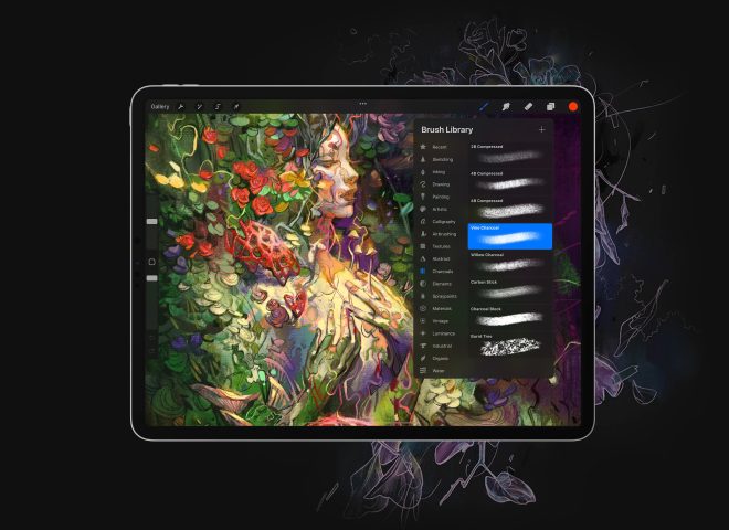
While Apple is taking away buttons, we’ve found a way to add one…
Apple has never been afraid to take design risks. Earlier this year, Apple made headlines when it revealed a new iPhone design that left out the iconic Home button. Now, we’re all for simplification. But for the design community, every further simplification of Apple hardware keeps us on our toes. It means searching for creative solutions to work around Apple’s constant quest for minimalism.
So when we ran out of buttons to hide our software’s UI behind, it really forced us to use our imagination. Instead of squeezing UI in where it didn’t fit, we built a new button to conceal it: it’s called the Camera Button.
We’re debuting the Camera Button in our latest product — Luna Display. But the Camera Button has been a long-time coming, and we want to share how we got here.
A mission to simplify tangled UI
Our problem started three years ago when we were working on our first product, Astropad. With Astropad mirroring your Mac screen on your iPad, you end up getting a unique UI overlap. First, there’s Mac UI showing up on your iPad, coming from whatever Mac program you’re using, such as Photoshop or Sketch. On top of that, there’s the native iPad UI. So if we wanted to add our own Astropad UI, where would it go? We didn’t want to create a crazy matrix of conflicting UI, so we looked for a way to minimize it.
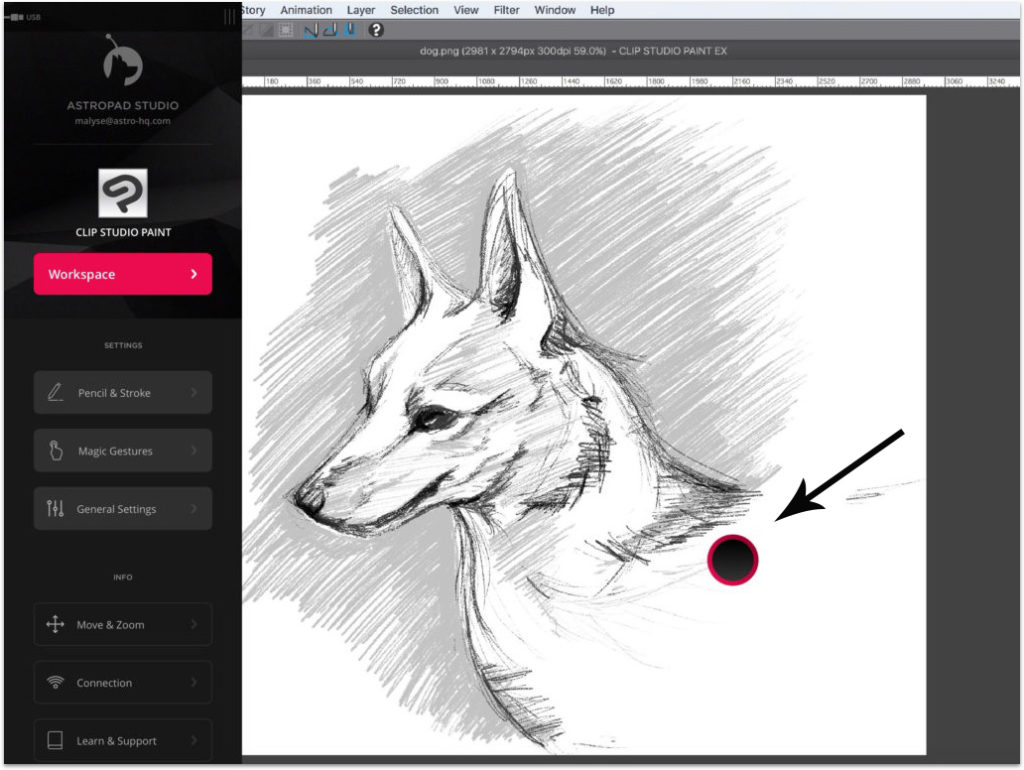
Our first solution for this tangled UI was the Astropad “ring.” It’s a little movable ring that always appears on your iPad screen when you’re working in Astropad. Tapping on it once brings up a sidebar with shortcuts and settings. Tap on it again and it disappears. But could we minimize our UI real estate even more? As handy as this little ring is, it can still get in the way.
Looking for room in a crowded space
We set out to find an alternative to the Astropad ring. The obvious first option was to make a new gesture, but we realized pretty quickly that there was limited room for this. Every edge of the iPad is already occupied with an existing gesture: swipe up for your dock, left to search, and down for notifications. We really needed something novel to work with.
Our Astro HQ co-founder, Giovanni Donelli, said that the idea to turn the camera into a button hit him like lightning: “I had been staring at a white bezel iPad for so long, and I kept wishing there was another home button we could use. My eyes kept falling on the camera, and I really wanted to touch it!” Giovanni built an initial prototype of the Camera Button within an hour.
Managing variables and maximizing efficiency
Turning the camera into a reliably functioning button didn’t come without challenges. In total, we spent four months of continuous engineering efforts to get past these hurdles:
Variable Lighting
The Camera Button works by detecting the amount of light coming in through the camera. Covering up the camera with your finger blocks all light, triggering a response from the iPad. The tricky part was getting it to work in all lighting conditions, across all iPad cameras.
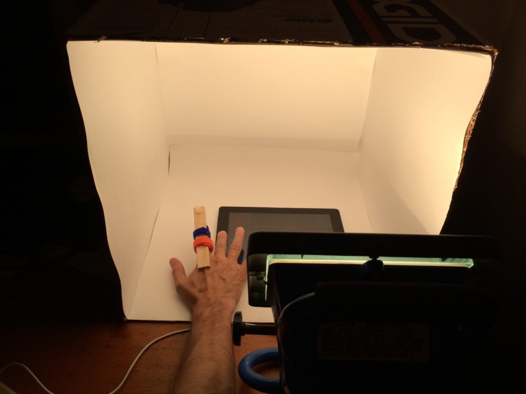
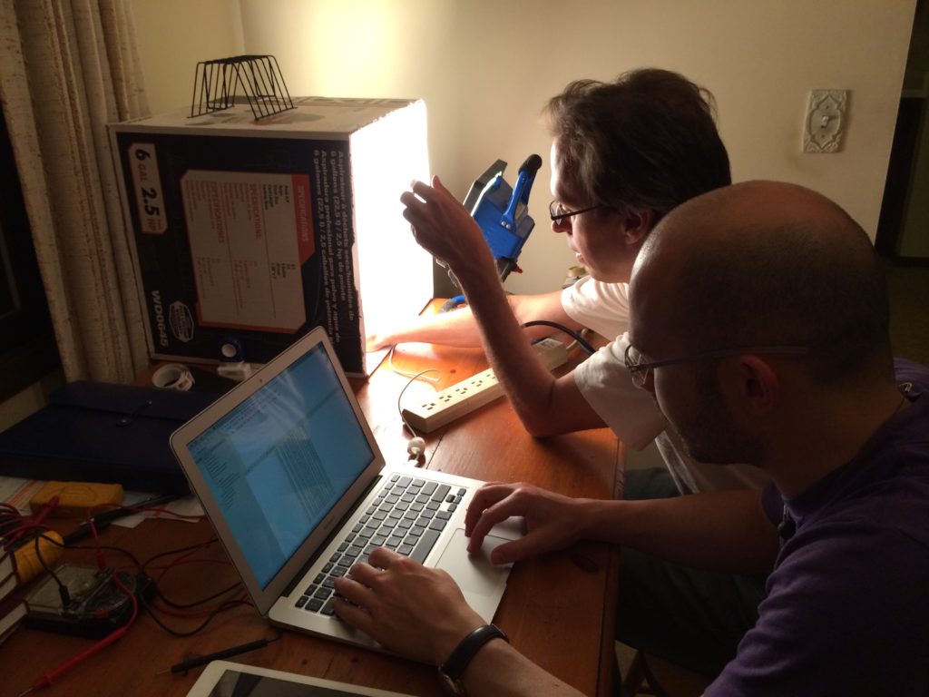
To test how the camera behaves in different lighting conditions, we built a makeshift lightbox. By manipulating the lighting, we were able to engineer the Camera Button to work predictably despite the brightness of the room. We even tested variances in finger pressure — how hard or lightly you tap the camera. The finger contraption in the photo below has an adjustment screw that controls how far the finger is depressed on the iPad camera.
Energy Efficiency
In order for the Camera Button to work, the camera needs to be constantly processing while using the app. So we made it a design goal from the beginning to ensure that it doesn’t affect battery life. This meant writing very efficient code based on algorithms that prioritized energy efficiency. After the code was written, we optimized it meticulously to eliminate any bottlenecks. Today, the Camera Button requires less than 1% CPU to run.
User Privacy
Maintaining user privacy is critical, and that meant finding ways to anonymize data coming in from the camera. The solution: blur the camera images to the point of not being able to see any data coming in so that the only thing the camera registers is the amount of light coming in. Additionally, data coming in through the camera never leaves the iPad and is never sent to a server.
Even though using the Camera Button is an optional setting in Luna, we understand that some users may not be comfortable with this feature. That’s why we also programmed the iPad volume buttons to have the same functionality as the Camera Button.
A sleek new iPad interaction
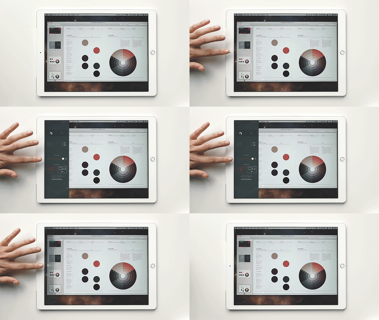
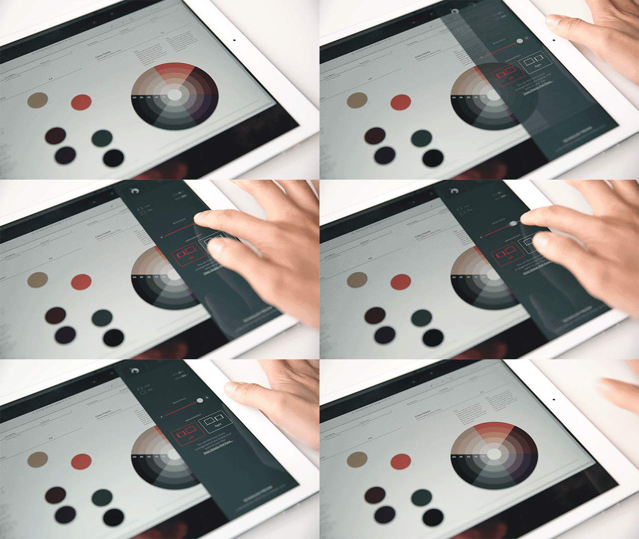
In total, we spent about six months building and testing the Camera Button. The result is a sleek and functional new interaction for your iPad that doesn’t interrupt your workflow. The Camera Button is making its first debut in Luna Display — our new hardware that turns the iPad into a second display for Mac. Tap the camera to bring out a simple interface to adjust screen brightness, display arrangement, and more.
In the end, designers and developers need to be constantly innovating to stay alive. But of course, that’s easier said than done. It took us a long time to see the opportunities for innovation around us; we had the Camera Button right under our nose (quite literally) for months before we saw its potential. When you’re searching for innovation, just remember that sometimes the most surprising solutions are hidden in the most mundane places — so it’s worth taking a second look at the ordinary.
Post update: RIP Camera Button
