Maker Spotlight: Jenny Famularcano
Jenny is an illustrator, animator, and hand-letterer living in Orange County, CA.
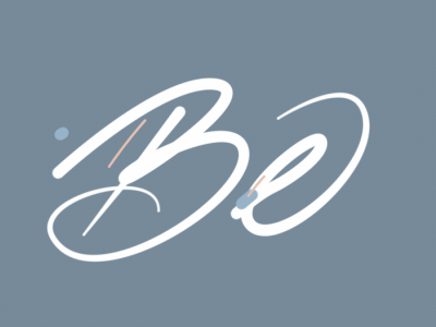
Her latest experimentation has been with animated typography: she’s currently doing a 100-Day Instagram Challenge, where she animates one word every day to share with her followers. You can follow her progress at @skybluejenny.

How do you typically use Instagram to showcase your art?
My Instagram is very personal and feelings-driven. It’s my work that’s not influenced by an art director or a client. Most of my Instagram is just stuff I’m learning or experimenting with. My usual thought process is, I feel like making this, so I’m going to try it out. I’m constantly learning and practicing new techniques. I like learning out loud.
Your 100-Day Challenge sounds like a lot of work! How do you pull it off?
It saves time to plan everything out as much as possible. I’ve planned out the words I’m lettering for each day in advance, so I have some idea of what I want to create.
I set aside no more than 1.5 hours each morning to work on a piece. It helps because I’m not a morning person by any means, so by assigning myself that time in the morning, it forces me to get my butt out of bed, sit down, and do the project before I’m late to work. It’s a really good motivator, and it’s nice to get creative in the morning. Overall, it’s fun and rewarding to see how you can grow through these types of projects.
What are you experimenting with right now?
Right now, I’m experimenting with motion. I had an idea in my head that I wanted to explore: what would it be like to have animated letters?
I’ve spent a lot of time practicing calligraphy. Eventually though, I felt like I was backing myself into a corner because the only potential I could see with calligraphy was wedding invitations and envelopes. I was curious to see how I could implement my calligraphy into the work that I do every day.

What’s challenging about animating type?
It’s difficult to think about my type as separate objects. I’ve always thought about calligraphy as the letters being connected. But when you’re animating, it’s about separate entities that are interacting with each other. The challenge is splitting up a word into different layers or different objects. You have to give each object it’s own life and spirit.
I have a background in performing on a hip hop dance team, so I like to think of animation calligraphy in terms of how to organize my cast of performers. In animation, my cast is the letters. I can tell them where they need to be on stage, and at what time. I can add audio too — giving letters a chance to live in tandem with music — it gives it an extra dimension.
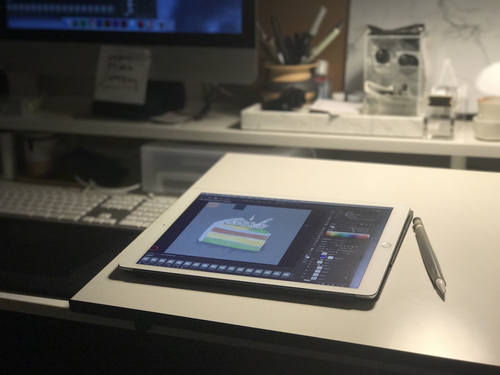
How do you use Astropad in this process?
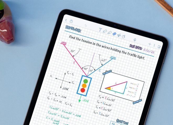
Astropad saves me so much time. Instead of hand-lettering on a piece of paper, scanning it in, and then cleaning it up digitally — I can draw directly into Photoshop with Astropad. It’s already a digital file, so it removes a level of friction that it takes me to do a project. I’m able to accomplish a whole project in an hour and a half using Astropad.
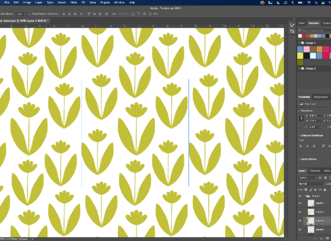
I love to be able to work in Photoshop when I’m with my computer. Kyle Webster has an amazing set of Photoshop brushes available for illustrators. They’re so beautiful, and I wanted an opportunity to use all of them.
The iPad Pro is the best purchase I’ve ever made for making art. It’s so compact — I can take it to work, bring it home, pack up everything and go.
What other styles do you want to experiment with?
There’s so much about illustration, type, and animation that I want to play with. I’d like to learn different types of script in calligraphy, so I can draw letterforms without needing to base it off of a font.
Also, I love clouds — it’s one of my obsessions. I want to see if I can push that subtly of clouds into type. Typically, type needs to be very clear in terms of contrast. But I’m wondering if I can bring the subtle value shifts of clouds into typography. I want to see how far I can push the legibility of that. “Will it even work? Will it look weird?” It’s an idea that’s been in my mind and I just need to try it.
What advice do you have for artists who want to experiment in other realms?
Make the time to do it. And don’t underestimate how much you can accomplish in just 15 or 30 minutes. We all have the time; it’s just about committing that time for yourself. If you attach a new habit to something that you already do, then it will be easier for you to achieve it. Just sketch it out. Draw it out. Just try it. Experiment. What do you have to lose!

Check out more of Jenny’s work:
- skybluejenny.com
- Sky Blue Jenny on Youtube
- Instagram: @skybluejenny
- Behance: behance.net/jennyfamularcano
Share your Astropad workflow with us on social using #Astropad for a chance to be featured.